« September 2010 | Main | August 2011 »

April 22, 2011

SiteoftheWeek: Fish

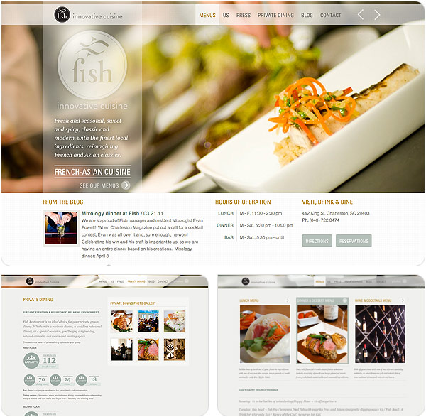
442 King St., Charleston, South Carolina. That’s the location of what looks like some exceptionally tasty cuisine. That’s where you will find Fish. From their website: “Fish Restaurant showcases the finest local, sustainable ingredients with an always-changing menu and a French-Asian flair. Executive chef Nico Romo, the youngest chef to ever earn the distinction of Master Chef of France, blends his skills at creating classic French fare with a zesty Asian-inspired artisan touch, resulting in fresh and flavorful dishes that engage and inspire.” Excellent pedigree for a chef and some tasty food. But, this IS about the design of the site, so I digress.

The site is very clean and elegant. At first glance, it looks like the site could be made in Flash, but upon inspection, it’s all just HTML and some nice jQuery calls. The transitions and rollovers are slick and the design of the elements have an airy kind of feeling to them. Light colors, translucent whites, lots of overlayed items. Lots of transparent PNG files. It’s a great combination of jQuery transitions and simple design.

To check out the site (or learn how to find the restaurant if you’re in Charleston), head over to http://www.fishrestaurantcharleston.com/.
April 15, 2011

SiteoftheWeek: Atlantic Records

There are a few things that I really love in this world. Music is one of them. And so as I was roaming the halls of the Internet this week, I came across this week’s site, Atlantic Records.

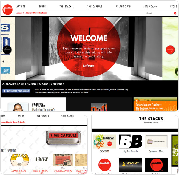
To be honest, I haven’t thought about record companies really since I lived in southern California, so when I came across Atlantic’s site, it was interesting to see some things that I had forgotten. (Like the fact that Phil Collins is with Atlantic. Big Phil fan in the 80s and 90s. Just had forgotten which label he was on.) The site is set up like a magazine, with little snippets of things, lots of white space, and nice sized images that give it a simple, classy feeling. Kind of a throwback to the earlier days of Atlantic. There are the usual things that you’d expect on a record label’s site, artist information, tour dates, lots of photos. Then there are some of the retro things like a historical look back at the earlier days of Atlantic. Old school ads. Vintage photos. Quotes from some the music’s greats. There’s a treasure trove of information about some the best musical artists in history and it’s all over the site, tucked into nice little nooks all over the place.

The “footer” is nice too. It’s on most every page and gives you a way to get to the Atlantic Merchandising page and then will do some location grabbing and give you shows by Atlantic artists that will be coming to your area soon. Great stuff.

For those who like music or just want to see some good, clean design, take a trip over to the Atlantic Records and enjoy!

April 6, 2011

Instagram: Floating Down Your Photo Stream

I like to take photos. I dare say that most people do. While very few of us count ourselves in the “Professional Photographer” camp, there’s something about being able to freeze a moment in time. And it’s something that has become significantly easier with the advent of the cell phone camera.

Being the iPhone 4 user that I am, there are a lot of great iPhone and iPod touch photo apps out there. Today, we’ll take a look at one of the hot ones at the moment, Instagram.

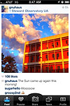
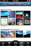
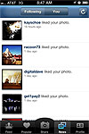
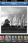
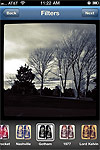
The idea for Instagram came from the mashing of the love for “instant” photography and the concept of telegrams being sent “over the wire” (or Internet as the case may be). What you get is a stream of photos that come from all over. They can be from your friends, your co-workers, or even perfect strangers. Once you download the app (which is free, by the way), you’re well on your way. How this all works is you can either take a photo with the Instagram app or select an image from your Photo Library and then, inside the app, you can add one of the filters to your photo or leave it untouched. There are a nice set of filters that are included with the app to help transform what could be a generically okay photo and help it look a bit more professionally processed. Once you filter (or not), then you add some info about the photo, some tags like on Twitter, and you’re done. Right now, when you post a photo, you can share individual photos on Flickr, Facebook, and Twitter. If you specify a location with your photo, you can tell the app to check you in on Foursquare.

Overall, the app is very simple and easy to use. The interface is very minimalistic and clean. The only place in the app that seems a bit off compared to the rest of the interface is the camera screen. It seems to almost be something that was an afterthought when the interface was designed. It’s simple and usable, but design-wise, it looks like a disconnect from the rest of the app. Some of the text links and buttons are a bit on the small side, but are still usable. You may have to try to tap some things a couple of times, but it’s not anything that should cause you to stop using the app. It’s just too much fun to see all the other photos that people post and all the other ways that you can post and filter your photos.

The app is free and available from the iTunes App Store.

You can catch my Instagram stream with my username, @tekitsune.


RELATED IMAGES


INSTAGRAM FILTERS

April 5, 2011

SiteoftheWeek: Grip Limited

It’s been quite a while, so I figured that a good way to get back into posting things is to find a great Site of the Week. In our first time out for our return to posting is an agency in Toronto called Grip Limited.

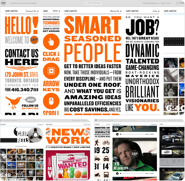
Interesting navigation. Overall, the site can seem a bit cluttered based on the concept of the design, but because of the complex nature of the site, it becomes more of an adventure for the viewer. There is a TON of information. (Like the line “Sill, it’s got to be reassuring to know that as part of the interview process we now ask candidates if they’ve ever raised champion livestock.” Poor livestock.) The design of the site is set up in columns, with the text in a carnival poster style using modern typefaces. Bold use black and orange is used throughout the site. While the site seems to go on forever (and is you move to the right, it DOES seem to go on FOREVER!), it’s fun to see what could be hanging off the edge of the page, including the columns and columns of their portfolio work.

The only drawback that I can see with the site is that it was produced in Flash. With all the potential with HTML5 today, there’s little need with how this was designed to be using Flash. But, that small thing aside, it’s a fun site that you can lose yourself in hours of searching, reading and playing.

To see all the insanity, point your browser to www.griplimited.com.