« April 2010 | Main | September 2010 »

July 30, 2010

Your Magazine's Social: Flipboard

flipboard.jpg

There’s been a lot of talk about a new social media app for the iPad over the last few weeks. It’s great little app called Flipboard. The aim of the app is to take feeds from various news-related sites and your personal Twitter and Facebook feeds to create a print magazine-like presentation for the topics that you care most about. Since Flipboard made it’s public debut on July 21, it’s been exceptionally swamped by iPad users that want to get a glimpse of the slick presentation that Flipboard gives you. I admit, I’ve been waiting for my email address to be given the green light to add my Facebook and Twitter feeds to the setup before I wrote up a review. I got my notification today, so I’ve been doing some poking around to see how things work.

I have to say that the app is really beautifully designed. The app launches with a nice pictorial view of a variety of possible “stories” from people that are in your feeds and from places that are pre-populated by Flipboard. Once on the Contents page, you can customize your screen to follow a variety of different topics and writers from pre-populated sources or you can search Twitter or Facebook for your favorite people.

It allows you to create a personal social magazine. You can flip through a magazine-style presentation of the things that your friends are posting to Facebook and Twitter, or you can add your favorite Twitter users and lists. You’re able to leave comments and share anything you read in the app. When your click on an article in the page view, you get a box with that specific article. On the article screen, you can also see any tweets that link to the article or post. If you just want to move on to the next article, you can just keep swiping and the next item will come up. Want to go back to your page view, just click on the little “x” in the top corner.

The only nitpick I have so far is that there are some connection problems occasionally with the Twitter and Facebook feeds. You’ll launch the app and you’ll get a “No Content” error on one or both of the boxes there. A lot of times that will go away if you close the app and relaunch, but it’s just a minor frustration. I suspect that it’s just a small connection problem with all the people out there trying to get this working.

The only other thing that I can see that could be a potential problem for Flipboard is the question of “Is Flipboard legal?” There have been a few place around the web that have tackled the topic, like Gizmodo and Wired, and I can understand both sides of the argument. Flipboard is using technology like the Reader function in Apple’s Safari browser to cache the content to Flipboard’s servers. Based on comments from Flipboard’s Co-founder Evan Doll, they are trying to be careful to not pull whole articles into Flipboard. Stories that come into the viewer are just little snippets of things and you can click on the “Read on Web” and get the full article. Tech pundits are wondering if the “content scraping” of non-affiliated sites is going to lead Flipboard to a copyright issue. How that will play out, we’ll have to just watch and see how that ends.

All that aside, Flipboard is a very slick app. It’s nice to see some out-of-the-box thinking with an app. If you have an iPad and your in to social media, Flipboard is a great app to have. The Flipboard App is available for free at www.flipboard.com or from the App Store on the iPad. Check it out!


RELATED IMAGES

July 29, 2010

SiteoftheWeek: Bowtie.

npz_bowtie.jpg

After being out of town for Comic-Con and some vacation time, it’s taken a bit to catch back up on life. I’ve got two reviews and some school stuff to finish up, but I didn’t want to miss out on the SiteoftheWeek this week. We have a fun site this week. It’s an interactive agency called Bowtie. Their site is just one page, but through some fun animations and a big ol’ pile of JavaScript, you get a fun presentation using a world metaphor for the navigation. You can click on the different parts of the scene, from the sky to the grass. You can scroll manually. You can use the up and down arrows to move in a set distance on the page. Then there are little animations that pop in from the side of the page. Just simple and a lot of fun. It an interesting use of REALLY big text too. No missing what is being said there. To see the site, head over to http://bowtieperiod.com/.

July 27, 2010

Fresh on the Press: MiceSigns

Just got finished with the first 14mph publication. I spent a good amount of time last week taking photos for a new photo book, looking at the signs around the Disneyland Resort in Anaheim, CA. This first book, MiceSigns, looks at a variety of signs from all over the Magic Kingdom. I took this as an opportunity to test the camera on the HTC Incredible and it did a really good job. There are 103 photos in the book and 88 were taken with the Incredible. I think the photos turned out rather well. We’re publishing this through the fine folks at Blurb. I’ve got first copy being printed as we speak. You can find Blurb and all sorts of other great books online at http://www.blurb.com/. Take a look!

July 20, 2010

SiteoftheWeek: Disneyland.com

npz_disneyland.jpg

Ok, there’s a little bias for this week’s SiteoftheWeek site. I’m sitting in the lobby of the Grand Californian Hotel at Disneyland in Anaheim, CA. While sitting here at Disneyland is a good thing, I’m able to use this as a good excuse to feature the all new Disneyland.com. The crew at Disney updated the Disneyland site for the first time in AGES and it’s a good overhaul. They’ve streamlined the entire site, making the design much more visually appealing. I really like the use of the big images on a majority of the pages. There’s a lot more information on the pages now and it’s just a much better site to use overall. Kudos to the web folks at Disney.

Now, it’s time for me to go find some of that great Disneyland food. Dinner!

July 15, 2010

Ridiculous and Absurd: The Downfall of Newsweek Tech

newsweektech.jpg

It’s Friday. Today, Apple CEO Steve Jobs held a press conference at Apple headquarters to discuss the iPhone 4 and all the negativity that’s been floating around the last few weeks. It’s been talked about since the iPhone 4 came out. The places where I’ve seen people with any clue about the situation with the iPhone antenna have said what Steve Jobs said in his press conference. Plenty of experts in antenna design and RF technology have said that this is nothing that is out of the ordinary. This is something that happens on every cell phone. My iPhone 3G does it. My Samsung Galaxy does it. Heck, the new HTC Incredible that I just got this week does the same thing. Hold any cell phone in the wrong way and you can cause the “bars” to drop. Signal attenuation is just a part of life when you’re dealing with radio frequency. I think this is just the first time that people have been able to see how the signal indicators on a cell phone are actually working. The thing that people don’t realize is that the bars are useless when it really comes to your signal on a cell phone.

Naturally, the Apple haters came out in force after Steve Jobs said that there wasn’t really a problem (which I don’t believe there is). Then as a compromise for the consumers, they offered free bumpers for people that want to have one. For some, that wasn’t good enough. Leading the way, it seems, is Newsweek “columnist” and self-proclaimed “Fake Steve Jobs,” Daniel Lyons.

I wonder if panic has started to set in at Newsweek yet. If not, it should. Because today’s hastily posted opinion by Daniel Lyons—ostensibly to spread unsupported iPhone 4 rumors and how Newsweek intends to ignore the truth—only did further damage to Newsweek’s reputation.<

“The problem is that because the phone’s antenna is embedded in its frame, your hand touches the antenna when you make a call. That can interfere with reception, to the point that in some cases calls get dropped.” It’s interesting that experts that have been talking, for example on, say, TWiT.tv’s shows have shown that this is a typical case for this, yes, it can interfere with reception. Despite that, there have been tests a plenty that show, no matter if the bars go all the way down, the calls don’t usually get dropped. It’s a point like this that the mainstream media prefers to ignore. The bars on your phone don’t mean anything. With regards to the RF signal for the iPhone 4, antenna engineer Spenser Webb from Antennasys.com said on one of the latest episodes of TWiT about their tests, “when we went down to the grip of death, in fact we didn’t just do the grip of death, we did the two handed grip of death and, yes, we almost, almost made it thinner. In that case we got it down to one bar but we couldn’t drop the - we couldn’t drop the call.” That’s the real point. You can get the bars down to nothing. Are people really dropping more calls? People that complain get asked that question and they can’t say that they do drop more calls. If an antenna engineer can’t get it to happen consistently, that doesn’t seem to be a problem, now, does it?

This is classic Daniel Lyons behavior. No matter what the knowledgable world says, he just keeps saying things that can’t be substantiated, and maybe, eventually, everyone will know that he’s full of it. By refusing to acknowledge the problem, Lyons just reinforced the image of Newsweek as a magazine that is in deep denial and unable to admit a big pile of mistakes—a company that has for so long been able to bend reality to suit its needs that it now has lost touch with reality itself.<

“Earlier this week Consumer Reports declared it could not recommend the phone until Apple comes up with a fix for this problem.” Ah yes, Consumer Reports. The land of contradiction. They say that they can’t recommend the iPhone 4, yet it’s one of (if not THE) top smartphones listed on their own site. A group that has already had engineers come out and say that their testing methods on the iPhone were totally flawed. Maybe people should not recommend the use of Consumer Reports until they can come up with real testing methods that are accurate. Makes you wonder what other things they have fudged in their “testing.” Food for thought.

More food for thought, I have to wonder what Newsweek is thinking. I’ve read plenty of articles by Daniel Lyons over the years. I’ve seen that Daniel Lyons has such hatred for all things Apple, it’s kinda embarrassing that he’s still allowed to write. The trust that journalists have had is disappearing because of things like this. Granted, it’s probably one of the reasons that, back in May the Washington Post Co., the owners of Newsweek, put the magazine up for sale.

Newsweek Managing Director Ann McDaniel said, “Our industry is changing. Newsweek has changed along with it, and today’s announcement reminds us that we must continue to grow, to adapt, to find new ways of serving readers, users and advertisers.” However, it’s writing like the misleading garbage that comes from the likes of Lyons that makes readers hate mainstream magazines. Biased writing being disguised as being subjective is killing things like Newsweek.

In a statement, Washington Post Co. Chairman Donald E. Graham said, “The losses at Newsweek in 2007-2009 are a matter of record. Despite heroic efforts on the part of Newsweek’s management and staff, we expect it to still lose money in 2010. We are exploring all options to fix that problem. Newsweek is a lively, important magazine and website, and in the current climate, it might be a better fit elsewhere.” Daniel Lyons is a perfect example of what can cause the downfall of a news magazine like Newsweek. Their work ceases to be news. It all just becomes like, well, a blog. And that’s something that Daniel Lyons hates. He was the author of a Forbes cover article, “Attack of the Blogs”, where he claimed that blogs “are the prized platform of an online lynch mob spouting liberty but spewing lies, libel and invective.” Reading articles by Lyons falls right into what he claims to hate. So sad.

All that aside, Apple admitted that they aren’t perfect. Yeah, some people claim to be having problems with their phones. I’ve had that problem with plenty of phones over the years. I just accept that as part of using a cell phone. Could Apple have handled things different? Sure. Is this all as big a deal as the mainstream media are making it out to be? Definitely not. At the end of the day, there’s still 3 million of these phones out there in the wild, sold in just 3 weeks. Steve Jobs said only 0.55 percent of iPhone 4 users have reported problems with their antenna or reception. Only 1.7 percent of customers are returning the new phone, compared to a 6 percent return rate on the iPhone 3GS. Most customers, Jobs said, say the new antenna gets better reception than any previous iPhones. Jobs also said all other mobile phones suffer the same problems when you hold them in certain ways, and that “it’s a challenge to the entire industry.”

Daniel Lyons said that “That’s ridiculous. It’s absurd.” But hey, that’s nothing new. I think Daniel Lyons has a history of making ridiculous claims. Fortunately 3 million people still love their iPhones. Even if they may have a Bumper on them.

July 14, 2010

The Creative Decline?

creativedecline.jpg

I’ve seen this topic battered around the last few days and it’s been a interesting topic, especially as someone that works in a creative industry. Newsweek posted an article to their website entitled The Creativity Crisis, where they analyze research that claims that creativity in America is declining. Whyfor, you may ask?

Pay No Attention to the Creative Behind the Curtain A lot of things have been pointed to as the cause of this “crisis” that’s facing America, but I think there’s something more fundamental that is at the root of the problem. Having spent nearly 20 years in the media production world, I’ve seen too many instances where people prefer to be ignorant or simply choose to ignore the people that know what good creativity is. As a designer, the bane of my existence is the client that refuses to listen to the expert that they hired to be creative and push forward with stuff that is, well, not creative. The problem isn’t that there’s something that is dulling the potential of the coming generations. It’s more the people today prefer to promote things that are mediocre. There was a time where people wanted the very best. I’ve found in the creative worlds that I’ve been in that people don’t seem to care a lot of times that things are the best they can be. The Newsweek article states, “The accepted definition of creativity is production of something original and useful… There is never one right answer. To be creative requires divergent thinking (generating many unique ideas) and then convergent thinking (combining those ideas into the best result).” That’s a good definition of creativity, but it’s one of those things that’s easier said than done. In the world today, where there’s so much around us and greater access to everything (thanks Internet!), it’s harder and harder to come up with something “original” today. It’s true, there is never one right answer, but today you’re more prone to be combining a bunch of ideas that have already been created and try to create something “new” from the hodgepodge of stuff we see and experience every day

Television and Video Games? Really? Gotta love that this is always the starting point. What does the mainstream media have against television and video games? I read the article on this topic by Audrey Watters over at ReadWriteWeb.com and my response is pretty much the same. I probably won’t dwell upon it too long cause it’s a sad, tired argument. Especially, as Audrey points out, the Newsweek article offers no proof that TV and video games are zapping the creativity out of the world. Yeah, anything in the world can eat up people’s time. TV and video games aren’t the cause.

Blame the Educators? One other statement that was made in the Newsweek article was “Another is the lack of creativity development in our schools. In effect, it’s left to the luck of the draw who becomes creative: there’s no concerted effort to nurture the creativity of all children.” I actually think this is the opposite of what’s happening. When I was in school, back in the 1980s, we had very few things that we did in school. We had the basics: reading, writing, science, and math. We had some art and music classes, maybe some computer-based classes, but beyond that, there wasn’t much else when it came to school. Contrary to what the Newsweek article talks about, I look at schools today and I think what we’re getting is more of a creativity overload. I’m not sure what schools they were looking at, but today, kids in high schools have all these “extracurricular” classes that are taking up their days. My brothers and sister got absorbed into things like Chamber Choirs, A Cappella groups, and Ballroom Dancing. The basics of english, math and science seemed secondary. It seemed, at least around here, that the kids were being pushed to get into all these “creative” classes.

Then there’s the argument that education in the U.S. is all about “standardized curriculum, rote memorization, and nationalized testing.” While I won’t dispute that, you can’t blame all of that for creativity’s decline. I’m all for getting rid of the memorization and all that testing that doesn’t mean much. I know too many intelligent people that can’t take a test to save their life, but they can do whatever they need to in a specific field. Tests prove very little, beyond showing how well you take tests. The concept of “standardized curriculum” doesn’t have to be the same though. Teachers can take the curriculum and can teach it in a way that gets kids thinking. To say that “oh, we have to follow the curriculum” doesn’t mean that you have to keep things boring. My best professors in school are the ones that had the curriculum but made things more relevant and interesting to us as individuals than the one that just follow the stuff on a page. It’s the concept of teaching people, not the lesson.

So, You Think You’re Creative? Of course, there is another possible answer. I’ve dealt with creatives for almost 20 year and observed college students that are in creative degrees the last three or four years. Contrary to what some people think, I don’t believe that creativity can be taught. You’re either a creative individual or you’re not. One of the things that never is talked about when you look at all these test that psychologists do are the people that weren’t creative. Just looking at all the college students that think they’re going to be artists, it’s almost a delusion. You could take one painting class and you talk to the teachers and student aides and there’s a pretty good consensus that 90% of the kids in these art classes shouldn’t be there. Why? They have a lack of creativity. And no matter how hard you try to teach things, you can teach the principles, but you can’t “teach” creativity. They use a rather flawed argument in the article, looking at playing basketball. A tall person can usually play basketball better than a shorter person. Both can learn to play the game well with practice. But there’s little creativity involved in playing sports.

It’s a sad generational thing. Kids today don’t need to be creative. They live in a world where they don’t want to have to do anything for themselves. From my own observations, a growing trend in the U.S. is that more and more people want something for nothing. They think that they’re owed something. Why be creative when you can try to get someone else to do everything for you? Most people today don’t have the drive to push the envelope and go places where a “normal” person would go. The successful creative people are the brave ones, venturing out into areas where they know that no one would be crazy enough to go, but they went there. Does it come down to fear? Who really knows. It definitely could be a factor as well.

The Newsweek article says that “creativity has always been prized in American society, but it’s never really been understood.” I have to agree. Especially after reading the article. All the psycho-babble in the world won’t ever understand creativity. It’s like all the talk about the iPhone 4 antenna and signal on your cell phone. Either you have it, or you don’t. I do like Audrey’s idea on what we can do to help though. Technology is one of the best ways to foster divergent and convergent thinking. I dare say, the newer generations love their tech. Just look at how much texting, tweeting and Facebooking is going on. We already know they like video games. Tech can help move the creativity forward. Like Audrey noted in her article, tech folks can pass the creativity on, cause they had the creativity to create the things that they have. We can help push the need for creativity to the forefront. We’re the ones that were crazy enough to venture into the unknown. You’d have to ask. If we don’t, who will?

July 13, 2010

SiteoftheWeek: Fully Illustrated

sotw_FullyIllustrated.jpg

It’s been a long time since I’ve done one of these, but it’s time to start up the Site of the Week. This week, we have a fun, exceptionally well designed site. Fully Illustrated is the portfolio of Michael Heald, a designer from across the pond, who specializes in design, illustration, photography and branding, mainly in the gaming space. Hebills Fully Illustrated as a “new media company” that gives you big agency creative for a small agency price. Fully Illustrated has created a slick site with just enough sparkle to keep things interesting, like the animation for his navigation pieces look like they would be created in Flash, but it’s all HTML, JavaScript, and CSS. Very slick. Looking at the site, it’s built on a WordPress base, so it’s got the ease of use of the WordPress content management, yet is a fresh design working around the basics of WordPress.

Michael’s work is very colorful, perfect for the segment that he does his work for, the gaming industry. He’s got a bright, fun, edgy feeling to the sites and designs that he’s got on display. I especially love his home page. It’s got a simple setup, with the big, bold images that show you the way to the different portions of his portfolio. That, combined with the dark background, makes for some big impact when you see the site. The navigation is simple and straightforward and doesn’t get in the way of things. Just a great, fun site that is simple and easy to use. And if you want to have some fun, head over to his FI-Blog. Great artwork and stuff there as well.

If you’d like to take a look at the full site, head on over to www.fullyillustrated.com.

July 12, 2010

To Yield or Not to Yield

yield.jpg

I have several pet peeves. One of them involves a small triangular sign that appears on roadsides periodically. Some of you may have seen it.


Now, for those that don’t know, that’s called a Yield Sign.

According to the U.S. Federal Highway Administration’s Manual on Uniform Traffic Control Devices, a YIELD sign may be warranted:

  1. On the approaches to a through street or highway where conditions are such that a stop is not always required.
  2. At the second crossroad of a divided highway, where the median width at the intersection is 9 m or greater. In this case, a STOP or YIELD sign may be installed at the entrance to the first roadway of a divided highway, and a YIELD sign may be installed at the entrance to the second roadway.
  3. On a channelized turn lane that is separated from the adjacent travel lanes by an island, even if the adjacent lanes at the intersection are controlled by a highway traffic control signal or by a STOP sign.
  4. At an intersection where a special problem exists and where engineering judgment indicates the problem to be susceptible to correction by the use of the YIELD sign.
  5. Facing the entering roadway for a merge-type movement if engineering judgment indicates that control is needed because acceleration geometry and/or sight distance is not adequate for merging traffic operation.

That’s a a lot of technical gobbledygook, but the long and the short of a yield sign means that a vehicle driver must slow down and prepare to stop if necessary — usually while merging into traffic on another road — but doesn’t need to stop if there is no reason to do so.

“No reason to do so” means if there are NO CARS traveling down the street you’re yielding for.

I tend to find that few people actually know what a yield sign means. Let’s do some math.


Yes, contrary to belief, YIELD does NOT equal MERGE. It’s become a rather big annoyance this week, since I’ve been in at least 4 situations where stupid things could have happened because other drivers think YIELD = MERGE or they just plain ignore the fact that the Yield sign is there. Since I happen to like my car and like even more to be able to drive myself to work and school every day, silly people ignoring the real meaning of a Yield sign can lead to some bad situations.

But all that pet peeve stuff aside, this is a design and art blog. What does this have to do with design? Well, most people don’t think about it, but the traffic signs that we see every day had to be designed by someone.

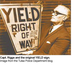
In the case of the Yield sign, the original concept and design was created by Capt. Clinton Riggs, a police officer in Tulsa, Oklahoma. According to the Tulsa Police Department’s official blog, “The first ‘yield right of way’ signs were installed on a test basis in 1950 at First Street and Columbia Avenue, the most dangerous intersection in Tulsa at that time.” The original design was a yellow keystone shape with black lettering (left). Over time, that evolved into triangular yellow signs that simply stated “yield” in black type to the red and white “Yield” signs that are part of the U.S. Department of Transportation’s official spec books for traffic signs that we typically see in the U.S. today.

I find it interesing to see where the designs of ordinary, everyday things like this come from. We tend to take some things, like traffic signs, for granted and never think that someone had to think up the designs for these things. Just a little useless fact there to help us remember that there’s design all around us. Even when we don’t think it’s there.

July 11, 2010

Design and Usability

designusability.jpg

As a designer and programmer, design and usability is always a touchy subject when you’re dealing with the Web. There are a lot of so-called “experts” out there that will tell you one thing and then another will come along and contradict it. When looking through any site dealing with design and usability, please keep in mind that 99% of the time, whatever is said amounts to the author’s opinion. As with anything creative, “beauty is in the eye of the beholder.” What may be look good and is very usable to you may not be for someone else. I’ve found the key to making sure that your site is all you hope it can be is to make sure that the site is designed so that your main audience is very comfortable using the site. If your intended audience can’t use the site, then all the time and effort end up being an exercise in futility.

Do a bit of research on who your audience is. Run some tests. Find out some of the places on the web that they like to use. Then use those common themes to help guide your design. You’ll thank yourself in the long run for it.

In order to help you on that road, here’s a list of some links that tend to fall in that 1% range of people that actually know what they’re talking about. Granted, take anything here with a grain of salt. It all comes down to personal preference with what people like.

General Reference

Web Usablity


Web Reference

Design Sites

Programs

Learn More