« November 2007 | Main | May 2009 »

December 26, 2008

Happy Holidays!

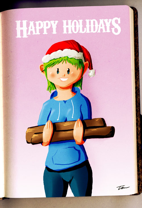
Direct from my sketchbook to everyone out there! :)

I've been playing with some new characters and some different drawing styles. I'm liking the look I think. Just need to play around some more. And I need to come up with a name for our girl here.

I'm a day late for Christmas, but I was enjoying being lazy yesterday, so I'm using that as my good excuse. Hope everyone out there is having a wonderful holiday season!


For the curious:
Based on a pencil sketch
Colored in Adobe Photoshop CS3
Time: ~2 hours


December 22, 2008

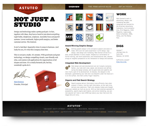
SiteoftheWeek: Astuteo

I’m a bit late with this week’s SiteoftheWeek. I was in Las Vegas over the weekend for the Las Vegas bowl football game and didn’t have Internet access until I got home late yesterday. But, better late than never, so here’s this week’s.

Astuteo is a nice, simple website for Matt Everson’s design studio. He keeps things simple by using only one page to get all his information across. The navigation bar is unobtrusive. The use of red behind the logo provides a great contrast to the white background and the brown colors used in the navigation bar. His samples keep it nice and simple as well, giving you just enough to be interesting while not giving away everything he’s trying to show.

Go check out the simplicity of the Astuteo site at http://www.astuteo.com/

December 17, 2008

Now Playing: Beyond Neverwonder

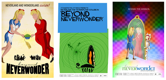
The semester is finally coming to an end. Here's some of the stuff that monopolized my time. These are the three poster designs that I created for my Senior Project entitled "Now Playing: The Evolution of Entertainment Advertising." It's a look at the evolution of styles and production techniques and technology in entertainment advertising. The poster portion was to show the different styles over time. I did a 1940s style design (left), a 1960s design as my ode to Saul Bass (center), and then the more modern 1980-1990s style poster (right).

Once more semester to go and I'll finally be done. After 18 years of chasing my degree, I'm glad it's finally coming to an end.

December 14, 2008

SiteoftheWeek: KA

This week's SiteoftheWeek is something unexpected. I had the fortune to spend the weekend in Las Vegas. I had a bunch of time to fill and since I don't frequent the casinos, I set myself up to see a show. And boy what a wonderful show!

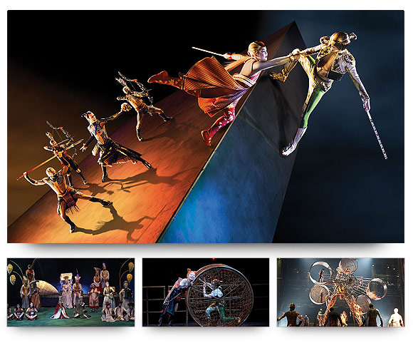
KA is one of the many Cirque du Soleil shows that happen in Vegas that made it's debut in February 2005. It's a coming-of-age story following the Imperial Twins, a brother and sister, through their martial arts sparring and the adventures that happen as their family was attacked and the twins end up being separated. The twins go through everything, from surviving the attack to finding love as they go through their journey.

The KA website bills the show this way:
KA transcends place and time, with a theatrical landscape, scenic elements and costumes inspired by an array of diverse cultures. Brought to life by 80 artists from around the world, KA is a gravity-defying production featuring a powerfully emotive soundtrack that enhances the innovative blend of acrobatic feats, Capoeira dance, puppetry, projections and martial arts.
KA is the big show at the MGM Grand. It's a fantastic spectacle of artistry and acrobatics. I have to say that the show was excellent. From an artistic standpoint, the color and design of the show was fun and great to see in motion. Yes, videos don't do the production justice. You have to see it live. The contrasts in color and neutrality work excellently with the production and makes for a great time if you happen to find yourself in Vegas.

For more about KA, see their site at http://www.ka.com/ and for more about the rest of the Cirque du Soleil shows, visit their site at http://www.cirquedusoleil.com/.
December 7, 2008

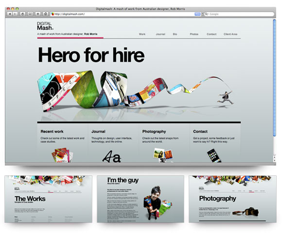
SiteoftheWeek: Digitalmash

Digitalmash is the website for Australian designer Rob Morris. He’s got a wonderfully designed site. It’s very simplistic and clean, just simple black on a nice gray gradient. I love his use of color on the pages and the use of the BIG Helvetica. They’re all great in contrast to the background of the site. No way to forget where you are on the site.

I have to be honest and say that this is probably one of the best designs for a site that I’ve seen a quite a while. With the insanely large amount of poor-to-bad design out there, this is a very refreshing break from the usual.

Go check out Rob’s site at http://www.digitalmash.com/